|
Glossary of Terms and Features

A |
B |
C |
D |
E |
F |
G |
H |
I |
J |
K |
L |
M |
N |
O |
P |
Q |
R |
S |
T |
U |
V |
W |
X |
Y |
Z
You are welcome to cite or reproduce these glossary definitions. Please cite or link:
Author AA. "Insert Glossary Term Here."
From The WebQTL Glossary--A GeneNetwork Resource. gn1.genenetwork.org/glossary.html
A
Additive Allele Effect:
The additive allele effect is an estimate of the change in the average phenotype that would be produced by substituting a single allele of one type with that of another type (e.g., a replaced by A) in a population. In a standard F2 intercross between two inbred parental lines there are two alleles at every polymorphic locus that are often referred to as the little "a" allele and big "A" allele. F2 progeny inherit the a/a, a/A, or A/A genotypes at every genetic locus in a ratio close to 1:2:1. The additive effect is half of the difference between the mean of all cases that are homozygous for one parental allele (aa) compared to the mean of all cases that are homozygous for the other parental allele (AA):
[(mean of AA cases)-(mean of aa cases)]/2
GeneNetwork displays the additive values on the far right of many trait/QTL maps, usually as red or green lines along the maps. The units of measurement of additive effects (and dominance effects) are defined by the trait itself and are shown in Trait Data and Analysis windows. For mRNA estimates these units are usually normalized log2 expression values. For this reason an additive effect of 0.5 units indicates that the A/A and a/a genotypes at a particular locus or marker differ by 1 unit (twice the effect of swapping a single A allele for an a allele). On this log2 scale this is equivalent to a 2-fold difference (2 raised to the power of 1).
On the QTL map plots the polarity of allele effects is represented by the color of the line. For example, in mouse BXD family maps, if the DBA/2J allele produces higher values than the C57BL/6J allele then the additive effect line is colored in green. In contrast, if the C57BL/6J allele produces higher values then the line is colored in red. For computational purposes, C57BL/6J red values are considered negative.
The dominance effects of alleles are also computed on maps for F2 populations (e.g., B6D2F2 and B6BTBRF2). Orange and purple line colors are used to distinguish the polarity of effects. Purple is the positive dominance effect that matches the polarity of the green additive effect, whereas orange is the negative dominance effect that matches the polarity of the red additive effect.
[Please also see entry on Dominance Effects: Williams RW, Oct 15, 2004; Sept 3, 2005; Dec 4, 2005; Oct 25, 2011]
Back to Index
B
Bootstrap:
A bootstrap sample is a randomly drawn sample (or resample) that is taken from the original data set and that has the same number of samples as the original data set. In a single bootstrap sample, some cases will by chance be represented one or more times; other cases may not be represented at all (in other words, the sampling is done "with replacement" after each selection). To get a better intuitive feel for the method, imagine a bag of 26 Scrabble pieces that contain each letter of the English alphabet. In a bootstrap sample of these 26 pieces, you would shake the bag, insert your hand, and draw out one piece. You would then write down that letter on a piece of paper, and the place that Scrabble piece back in the bag in preparation for the next random selection. You would repeat this process (shake, draw, replace) 25 more times to generate a single bootstrap resample of the alphabet. Some letters will be represented several time in each sample and others will not be represented at al. If you repeat this procedure 1000 times you would have a set of bootstrap resamples of the type that GN uses to remap data sets.
Bootstrap resampling is a method that can be used to estimate statistical parameters and error terms. GeneNetwork uses a bootstrap procedure to evaluate approximate confidence limits of QTL peaks using a method proposed by Peter Visscher and colleagues (1996). We generate 2000 bootstraps, remap each, and keep track of the location of the single locus with the highest LRS score locations (equivalent to a "letter" in the Scrabble example). The 2000 "best" locations are used to produce the yellow histograms plotted on some of the QTL maps. If the position of a QTL is firm, then the particular composition of the sample, will not shift the position of the QTL peak by very much. In such a case, the histogram of "best QTLs" (yellow bars in the maps) that is displayed in WebQTL maps will tend to have a sharp peak (the scale is the percentage of bootstrap resamples that fall into each bar of the bootstrap histogram). In contrast, if the the yellow bootstrap histograms are spread out along a chromosome, then the precise location of a QTL may not be accurate, even in the original correct data set. Bootstrap results naturally vary between runs due to the random generation of the samples. See the related entry "Frequency of Peak LRS."
KNOWN PROBLEMS and INTERPRETATION of BOOTSTRAP RESULTS: The reliability of bootstrap analysis of QTL confidence intervals has been criticized by Manichaikul and colleagues (2006). Their work applies in particular to standard intercrosses and backcrosses in which markers are spaced every 2 cM. They recommend that confidence intervals be estimated either by a conventional 1.5 to 2.0 LOD drop-off interval or by a Bayes credible Interval method.
There is a known flaw in the way in which GeneNetwork displays bootstrap results (Sept 2011). If a map has two or more adjacent markers with identical LOD score and identical strain distribution patterns, all of the bootstrap results are assigned incorrectly to just one of the "twin" markers. This results in a false perception of precision.
QTL mapping methods can be highly sensitive to cases with very high or very low phenotype values (outliers). The bootstrap method does not provide protection against the effects of outliers and their effects on QTL maps. Make sure you review your data for outliers before mapping. Options include (1) Do nothing, (2) Delete the outliers and see what happens to your maps, (3) Winsorize the values of the outliers. You might try all three options and determine if your main results are stable or not. With small samples or extreme outliers, you may find the mapping results to be quite volatile. In general, if the results (QTL position or value) depend highly on one or two outliers (5-10% of the samples) then you should probably delete or winsorize the outliers.
[Williams RW, Oct 15, 2004, Mar 15, 2008, Mar 26, 2008; Sept 2011]
Back to Index
C
CEL and DAT Files (Affymetrix):
Array data begin as raw image files that are generated using a confocal microscope and video system. Affymetrix refers to these image data files as DAT files. The DAT image needs to be registered to a template that assigns pixel values to expected array coordinates (cells). The result is an assignment of a set of image intensity values (pixel intensities) to each probe. For example, each cell/probe value generated using Affymetrix arrays is associated with approximately 36 pixels (a 6x6 set of pixels, usually with an effective 11 or 12-bit range of intensity). Affymetrix uses a method that simply ranks the values of these pixels and picks as the "representative value" the pixel that is has rank 24 from low to high. The range of variation in intensity amoung these ranked pixels provides a way to estimate the error of the estimate. The Affymetrix CEL files therefore consist of XY coordinates, the consensus value, and an error term. [Williams RW, April 30, 2005]
Cluster Map or QTL Cluster Map:
Cluster maps are sets of QTL maps for a group of traits. The QTL maps for the individual traits (up to 100) are run side by side to enable easy detection of common and unique QTLs. Traits are clustered along one axis of the map by phenotypic similarity (hierarchical clustering) using the Pearson product-moment correlation r as a measurement of similarity (we plot 1-r as the distance). Traits that are positively correlated will be located near to each other. The genome location is shown along the other, long axis of the cluster map, marker by marker, from Chromosome 1 to Chromosome X. Colors are used to encode the probability of linkage, as well as the additive effect polarity of alleles at each marker. These QTL maps are computed using the fast Marker Regression algorithm. P values for each trait are computed by permuting each trait 1000 times. Cluster maps could be considered trait gels because each lane is loaded with a trait that is run out along the genome. Cluster maps are a unique feature of the GeneNetwork developed by Elissa Chesler and implemented in WebQTL by J Wang and RW Williams, April 2004. [Williams RW, Dec 23, 2004, rev June 15, 2006 RWW].
Collections and Trait Collections:
One of the most powerful features of GeneNetwork (GN) is the ability to study large sets of traits that have been measured using a common genetic reference population or panel (GRP). This is one of the key requirements of systems genetics--many traits studied in common. Under the main GN menu Search heading you will see a link to Trait Collections. You can assemble you own collection for any GRP by simply adding items using the Add to Collection button that you will find in many windows. Once you have a collection you will have access to a new set of tools for analysis of your collection, including QTL Cluster Map, Network Graph, Correlation Matrix, and Compare Correlates. [Williams RW, April 7, 2006]
Complex Trait Analysis:
Complex trait analysis is the study of multiple causes of variation of phenotypes within species. Essentially all traits that vary within a population are modulated by a set of genetic and environmental factors. Finding and characterizing the multiple genetic sources of variation is referred to as "genetic dissection" or "QTL mapping." In comparison, complex trait analysis has a slightly broader focus and includes the analysis of the effects of environmental perturbation, and gene-by-environment interactions on phenotypes; the "norm of reaction." Please also see the glossary term "Systems Genetics." [Williams RW, April 12, 2005]
Composite Interval Mapping:
Composite interval mapping is a method of mapping chromosomal regions that controls for some fraction of the genetic variability in a quantitative trait. Unlike simple interval mapping, composite interval mapping usually controls for variation produced at one or more background marker loci. These background markers are generally chosen because they are already known to be close to the location of a significant QTL. By factoring out a portion of the genetic variance produced by a major QTL, one can occasionally detect secondary QTLs. WebQTL allows users to control for a single background marker. To select this marker, first run the Marker Regression analysis (and if necessary, check the box labeled display all LRS, select the appropriate locus, and the click on either Composite Interval Mapping or Composite Regression. A more powerful and effective alternative to composite interval mapping is pair-scan analysis. This latter method takes into accounts (models) both the independent effects of two loci and possible two-locus epistatic interactions. [Williams RW, Dec 20, 2004]
Correlations: Pearson and Spearman:
GeneNetwork provides tools to compute both Pearson product-moment correlations (the standard type of correlation), Spearman rank order correlations. Wikipedia and introductory statistics text will have a discussion of these major types of correlation. The quick advice is to use the more robust Spearman rank order correlation if the number of pairs of observations in a data set is less than about 30 and to use the more powerful but much more sensitive Pearson product-moment correlation when the number of observations is greater than 30 AND after you have dealt with any outliers. GeneNetwork automatically flags outliers for you in the Trait Data and Analysis form. GeneNetwork also allows you to modify values by either deleting or winsorising them. That means that you can use Pearson correlations even with smaller sample sizes after making sure that data are well distributed. Be sure to view the scatterplots associated with correlation values (just click on the value to generate a plot). Look for bivariate outliers.
Cross:
The term Cross refers to a group of offspring made by mating (crossing) one strain with another strain. There are several types of crosses including intercrosses, backcrosses, advanced intercrosses, and recombinant inbred intercrosses. Genetic crosses are almost always started by mating two different but fully inbred strains to each other. For example, a B6D2F2 cross is made by breeding C57BL/6J females (B6 or B for short) with DBA/2J males (D2 or D) and then intercrossing their F1 progeny to make the second filial generation (F2). By convention the female is always listed first in cross nomenclature; B6D2F2 and D2B6F2 are therefore so-called reciprocal F2 intercrosses (B6D2F1 females to B6D2F1 males or D2B6F1 females to D2B6F1 males). A cross may also consist of a set of recombinant inbred (RI) strains such as the BXD strains, that are actually inbred progeny of a set of B6D2F2s. Crosses can be thought of as a method to randomize the assignment of blocks of chromosomes and genetic variants to different individuals or strains. This random assignment is a key feature in testing for causal relations. The strength with which one can assert that a causal relation exists between a chromosomal location and a phenotypic variant is measured by the LOD score or the LRS score (they are directly convertable, where LOD = LRS/4.61) [Williams RW, Dec 26, 2004; Dec 4, 2005].
Back to Index
D
Dominance Effects:
The term dominance indicates that the phenotype of intercross progeny closely resemble one of the two parental lines, rather than having an intermediate phenotype. Geneticists commonly refer to an allele as having a dominance effect or dominance deviation on a phenotype. Dominance deviation at a particular marker are calculated as the difference between the average phenotype of all cases that have the Aa genotype at that marker and the expected value half way between the all casese that have the aa genotype and the AA genotype. For example, if the average phenotype value of 50 individuals with the aa genotype is 10 units whereas that of 50 individuals with the AA genotype is 20 units, then we would expect the average of 100 cases with the Aa genotype to be 15 units. We are assuming a linear and perfectly additive model of how the a and A alleles interact. If these 100 Aa cases actually have a mean of 11 units, then this additive model would be inadequate. A non-linear dominance terms is now needed. In this case the low a alleles is almost perfectly dominant (or semi-dominant) and the dominance deviation is -4 units.
The dominance effects are computed at each location on the maps generated by the WebQTL module for F2 populations (e.g., B6D2F2 and B6BTBRF2). Orange and purple line colors are used to distinguish the polarity of the dominance effects. Purple is the positive dominance effect that matches the polarity of the green additive effect, whereas orange is the negative dominance effect that matches the polarity of the red additive effect.
Note that dominance deviations cannot be computed from a set of recombinant inbred strains because there are only two classes of genotypes at any marker (aa and AA, more usuually written AA and BB). However, when data for F1 hybrids are available one can estimate the dominance of the trait. This global phenotypic dominance has almost nothing to do with the dominance deviation at a single marker in the genome. In other words, the dominance deviation detected at a single marker may be reversed or neutralized by the action of many other polymorphic genes.
[Williams RW, Dec 21, 2004; Sept 3, 2005]
Back to Index
E
Epistasis:
Epistasis means that combined effects of two or more different loci or polymorphic genes are not what one would expect given the addition of their individual effects. There is, in other words, evidence for non-linear interactions among two or more loci. This is similar to the dominance effects mentioned above, but now generalized to two or more distinct loci, rather than to two or more alleles at a single locus. For example, if QTL 1 has an A allele that has an additive effects of +5 and QTL 2 has an A alleles that has an additive effect of +2, then the two locus genotype combination A/A would be expected to boost the mean by +7 units. But if the value of these A/A individuals was actually -7 we would be quite surprised and would refer to this as an epistatic interaction between QTL 1 and QTL 2. WebQTL will search for all possible epistatic interactions between pairs of loci in the genome. This function is called a Pair Scan becasue the software analyzes the LRS score for all possible pairs of loci. Instead of viewing an LRS plot along a single dimension, we now view a two-dimensional plot that shows a field of LRS scores computed for pairs of loci. Pair scan plots are extremely sensitive to outlier data. Be sure to review the primary data carefully using Basic Statistics. Also note that this more sophisiticated method also demands a significantly larger sample size. While 25 to 50 cases may be adequate for a conventional LRS plot (sometimes called a "main scan"), a Pair-Scan is hard to apply safely with fewer than 60 cases. [Williams RW, Dec 21, 2004; Dec 5, 2005]
Effect Size of a QTL:
QTLs can be ranked by the amount of variance that they explain--their so-called "effect size"--when they are included in a statistical model. The concept of a genetic model may seem odd to some users of GeneNetwork. A model is just an explicit hypothesis of how QTLs and other factors cause variation in a trait. QTL mapping involves comparisons of the explanatory power of different models. Effect sizes can be measured in different units including (1) the percentage of total or genetic variance that is explained by adding the QTL into the model, (2) the mean shift in Z score, or (3) the additive effect size expressed in the original measurement scale. Effects of single QTLs are often dependent on genetic background (i.e., other QTLs and their interactions) and on the numbers and types of cases used in a study. For example, the variance explained is influenced strongly by whether the sample are from a family cohort, a case-control cohort, a group of fully inbred strains such as recombinant inbred lines, an outcross or backcross population.
Please note that the functional importance of a locus, QTL, or GWAS hit can not be predicted by the size of its effect on the trait in one environment, at one stage of development, and in one population. Estimates of the effect size of QTLs are usually both noisy and upwardly biased (overestimated), and both of these problems are particularly acute when sample sizes are small.
Estimates of effect size for families of inbred lines, such as the BXD, HXB, CC, and hybrid diversity panels (e.g. the hybrid mouse diversity panel and the hybrid rat diversity panel) are typically (and correctly) much higher than those measured in otherwise similar analysis of intercrosses, heterogeneous stock (HS), or diversity outbred stock. Two factors contribute to the much higher level of explained variance of QTLs when using inbred strain panels.
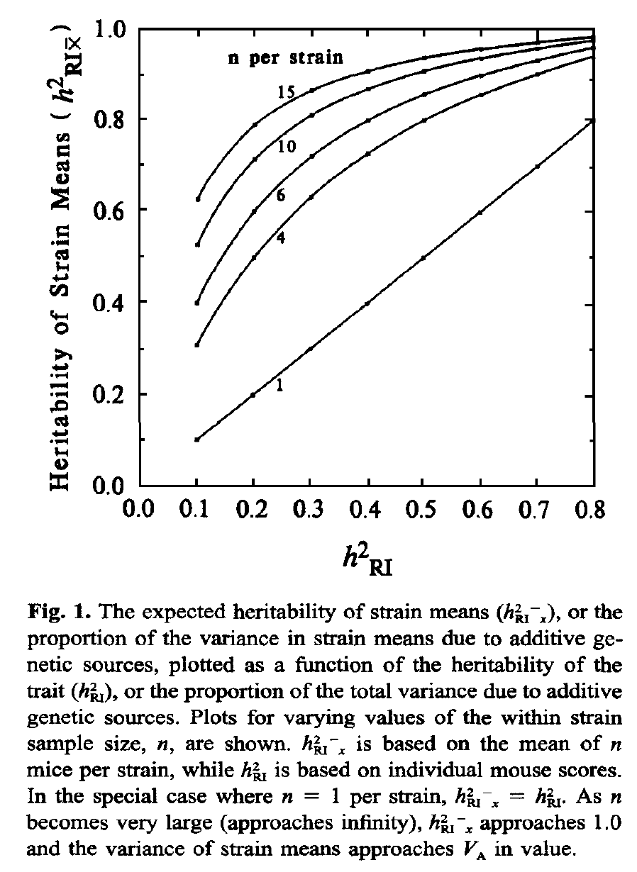
- Replication Rate: The variance that can be explained by a locus is increased by sampling multiple cases that have identical genomes and by using the strain mean for genetic analysis. Increasing replication rates from 1 to 6 can easily double the apparent heritability of a trait and therefore the effect size of a locus. The reason is simple—resampling decrease the standard error of mean, boosting the effective heritability (see Glossary entry on Heritability and focus on figure 1 from the Belknap 1998 paper reproduced below).
Compare the genetically explained variance (labeled h2RI in this figure) of a single case (no replication) on the x-axis with the function at a replication rate of 4 on the y-axis. If the explained variance is 0.1 (10% of all variance explained) then the value is boosted to 0.3 (30% of strain mean variance explained) with n = 4.
- Homozygosity: The second factor has to do with the inherent genetic variance of populations. Recombinant inbred lines are homozygous at nearly all loci. This doubles the genetic variance in a family of recombinant inbred lines compared to a matched number of F2s. This also quadruples the variance compared to a matched number of backcross cases. As a result 40 BXDs sampled just one per genometype will average 2X the genetic variance and 2X the heritability of 40 BDF2 cases. Note that panels made up of isogenic F1 hybrids (so-called diallel crosses, DX) made by crossing recombinant inbred strains (BXD, CC, or HXB) are no longer homozygous at all loci, and while they do expose important new sources of variance associated with dominance, they do not benefit from the 2X gain in genetic variance relative to an F2 intercross.
For the reasons listed above a QTL effect size of 0.4 detected a panel of BXD lines replicated four times each (160 cases total), corresponds approximately to an effect size of 0.18 in BXDs without replication (40 cases total), and to an effect size of 0.09 in an F2 of 40 cases total.
[Williams RW, Dec 23, 2004; updated by RWW July 13, 2019]
eQTL, cis eQTL, trans eQTL
An expression QTL or eQTL. Differences in the expression of mRNA or proteins are often treated as standard phenotypes, much like body height or lung capacity. The variation in these microscopic traits (microtraits) can be mapped using conventional QTL methods. Damerval and colleagues were the first authors to use this kind of nomenclature and in their classic study of 1994 introduced the term PQLs for protein quantitative trait loci. Schadt and colleagues added the acronym eQTL in their early mRNA study of corn, mouse, and humans. We now are "blessed" with all kinds of prefixes to QTLs that highlight the type of trait that has been measured (m for metabolic, b for behavioral, p for physiological or protein).
eQTLs of mRNAs and proteins have the unique property of (usually) having a single parent gene and genetic location. An eQTL that maps to the location of the parent gene that produces the mRNA or protein is referred to as a cis eQTL or local eQTL. In contrast, an eQTL that maps far away from its parent gene is referred to as a trans eQTL. You can use special search commands in GeneNetwork to find cis and trans eQTLs.
[Williams RW, Nov 23, 2009, Dec 2009]
Back to Index
F
Frequency of Peak LRS:
The height of the yellow bars in some of the Map View windows provides a measure of the confidence with which a trait maps to a particular chromosomal region. WebQTL runs 2000 bootstrap samples of the original data. (A bootstrap sample is a "sample with replacement" of the same size as the original data set in which some samples will by chance be represented one of more times and others will not be represented at all.) For each of these 2000 bootstraps, WebQTL remaps each and keeps track of the location of the single locus with the highest LRS score. These accumulated locations are used to produce the yellow histogram of "best locations." A frequency of 10% means that 200 of 2000 bootstraps had a peak score at this location. It the mapping data are robust (for example, insensitive to the exclusion of an particular case), then the bootstrap bars should be confined to a short chromosomal interval. Bootstrap results will vary slightly between runs due to the random generation of the bootstrap samples. [Williams RW, Oct 15, 2004]
False Discovery Rate (FDR):
A false discovery is an apparently significant finding--usually determined using a particular P value alpha criterion--that given is known to be insignificant or false given other information. When performing a single statistical test we often accept a false discovery rate of 1 in 20 (p = .05). False discovery rates can climb to high levels in large genomic and genetic studies in which hundreds to millions of tests are run and summarized using standard "single test" p values. There are various statistical methods to estimate and control false discovery rate and to compute genome-wide p values that correct for large numbers of implicit or explicit statistical test. The Permutation test in GeneNetwork is one method that is used to prevent and excessive number of false QTL discoveries. Methods used to correct the FDR are approximations and may depend on a set of assumptions about data and sample structure. [Williams RW, April 5, 2008]
Back to Index
G
Genes, GenBankID, UniGeneID, GeneID, LocusID:
GeneNetwork provides summary information on most of the genes and their transcripts. Genes and their alternative splice variants are often are poorly annotated and may not have proper names or symbols. However, almost all entries have a valid GenBank accession identifier. This is a unique code associated with a single sequence deposited in GenBank (Entrez Nucleotide). A single gene may have hundreds of GenBank entries. GenBank entries that share a genomic location and possibly a single gene are generally combined into a single UniGene entry. For mouse, these always begin with "Mm" (Mus musculus) and are followed by a period and then a number. More than half of all mouse UniGene identifiers are associated with a reputable gene, and these genes will have gene identifiers (GeneID). GeneIDs are identical to LocusLink identifiers (LocusID). Even a 10 megabase locus such as human Myopia 4 (MYP4) that is not yet associated with a specific gene is assigned a GeneID--a minor misnomer and one reason to prefer the term LocusID.
See the related FAQ on "How many genes and transcripts are in your databases and what fraction of the genome is being surveyed?"
[Williams RW, Dec 23, 2004, updated Jan 2, 2005]
Genetic Reference Population (GRP):
A genetic reference population consists of a set of genetically well characterized lines that are often used over a long period of time to study a multitude of different phenotypes. Once a GRP has been genotyped, subsequent studies can focus on the analysis of interesting and important phenotypes and their joint and independent relations. Most of the mouse GRPs, such as the BXDs used in the GeneNetwork, have been typed using a common set of over 14,000 makers (SNPs and microsatellites). Many of these same GRPs have been phenotyped extensively for more than 25 years, resulting in rich sets of phenotypes. A GRP is an ideal long-term resource for systems genetics because of the relative ease with which vast amounts of diverse data can be accumulated, analyzed, and combined.
The power of GRPs and their compelling scientific advantages derive from the ability to study multiple phenotypes and substantial numbers of genetically defined individuals under one or more environmental conditions. When accurate phenotypes from 20 or more lines in a GRP have been acquired it becomes practical to explore and test the genetic correlations between that trait and any previously measured trait in the same GRP. This fact underlies the use of the term reference in GRP. Since each genetic individual is represented by an entire isogenic line--usually an inbred strain or an isogenic F1 hybrid--it is possible to obtain accurate mean phenotypes associated with each line simply by typing several individuals. GRPs are also ideal for developmental and aging studies because the same genetic individual can be phenotyped at multiple stages.
A GRP can also be used a conventional mapping panel. But unlike most other mapping panel, a GRP can be easily adapted to jointly map sets of functionally related traits (multitrait mapping); a more powerful method to extract causal relations from networks of genetic correlations.
The largest GRPs now consist of more than 400 recombinant inbred lines of Arabidopsis and maize. The BayxSha Arabidopsis set in the GeneNetwork consists of 420 lines. Pioneer Hi-Bred International is rumored to have as many as 4000 maize RI lines. The largest mammalian GRPs are the LXS and BXD RI sets in the GeneNetwork. The Collaborative Cross is the largest mammalian GRP, and over 600 of these strains are now being bred by members of the Complex Trait Consortium.
There are several subtypes of GRPs. In addition to recombinant inbred strains there are
- Recombinant congenic (RCC) strains such as the AcB set
- Consomic or chromosome substitution strains (CSS) of mice (Matin et al., 1999) and rats (Roman et al., 2002)
- Recombinant intercross (RIX) F1 sets made by mating different RI strains to each other to generate large set of R! first generation (F1) progeny (RIX). This is a standard (diallel cross) of RI inbred strains. Genetic analysis of a set of RIX progeny has some advantages over a corresponding analysis of RI strains. The first of these is that while each set of F1 progeny is fully isogenic (AXB1 x AXB2 gives a set of isogenic F1s), these F1s are not inbred but are heterozygous at many loci across the genome. RIX therefore retain the advance of being genetically defined and replicable, but without the disadvantage of being fully inbred. RIX have a genetic architecture more like natural populations. The second correlated advantage is that it is possible to study patterns of dominance of allelic variants using an RIX cross. Almost all loci or genes that differs between the original stock strains (A and B) will be heterozygous among a sufficiently larges set of RIX. A set of RIX progeny can therefore be mapped using the same methods used to map an F2 intercross. Mapping of QTLs may have somewhat more power and precision than when RI strains are used alone. A third advantage is that RIX sets make it possible to expand often limited RI resources to very large sizes to confirm and extend models of genetic or GXE effects. For example a set of 30 AXB strains can be used to generate a full matrix of 30 x 29 unique RIX progeny. The main current disadvantage of RIX panels is the comparative lack of extant phenotype data.
- Recombinant F1 line sets can also be made by backcrossing an entire RI sets to a single inbred line that carries an interesting mutation or transgene (RI backcross or RIB). GeneNetwork includes one RI backcross sets generated by Kent Hunter. In this RIB each of 18 AKXD RI strains were crossed to an FVB/N line that carries a tumor susceptibility allele (polyoma middle T).
All of these sets of lines are GRPs since each line is genetically defined and because the set as a whole can in principle be easily regenerated and phenotyped. Finally, each of these resources can be used to track down genetic loci that are causes of variation in phenotype using variants of standard linkage analysis.
A Diversity Panel such as that used by the Mouse Phenome Project is not a standard GRPs, although its also shares the ability to accumulate and study networks of phenotypes. The main difference is that a Diversity Panel cannot be used for conventional linkage analysis. A sufficiently large Diversity Panel could in principle be used for the equivalent of an assocation study. However, these are definitely NOT in silico studies, because hundreds of individuals need to be phenotyped for every trait. Surveys of many diverse isogenic lines (inbred or F1 hybrids) is statistically the equivalent of a human association study (the main difference is the ability to replicate measurements and study sets of traits) and therefore, like human association studies, does require very high sample size to map polygenic traits. Like human association studies there is also a high risk of false positive results due to population stratification and non-syntenic marker association.
A good use of a Diversity Panel is as a fine-mapping resource with which to dissect chromosomal intervals already mapped using a conventional cross or GRP. GeneNetwork now includes Mouse Diversity Panel (MDP) data for several data sets. We now typically include all 16 sequenced strains of mice, and add PWK/PhJ, NZO/HiLtJ (two of the eight members of the Collaborative Cross), and several F1 hybrids. The MDP data is often appended at the bottom of the GRP data set with which is was acquired (e.g., BXD hippocampal and BXD eye data sets).
[Williams RW, June 19, 2005; Dec 4, 2005]
Genotype: The state of a gene or DNA sequence, usually used to describe a contrast between two or more states, such as that between the normal state (wildtype) and a mutant state (mutation) or between the alleles inherited from two parents. All species that are included in GeneNetwork are diploid (derived from two parents) and have two copies of most genes (genes located on the X and Y chromosomes are exceptions). As a result the genotype of a particular diploid individual is actually a pair of genotypes, one from each parents. For example, the offspring of a mating between strain A and strain B will have one copy of the A genotype and one copy of the B genotype and therefore have an A/B genotype. In contrast, offspring of a mating between a female strain A and a male strain A will inherit only A genotypes and have an A/A genotype.
Genotypes can be measured or inferred in many different ways, even by visual inspection of animals (e.g. as Gregor Mendel did long before DNA was discovered). But now the typical method is to directly test DNA that has a well define chromosomal location that has been obtained from one or usually many cases using molecular tests that often rely on polymerase chain reaction steps and sequence analysis. Each case is genotyped at many chromosomal locations (loci, markers, or genes). The entire collection of genotypes (as many a 1 million for a single case) is also sometimes referred to as the cases genotype, but the word "genometype" might be more appropriate to highlight the fact that we are now dealing with a set of genotypes spanning the entire genome (all chromosomes) of the case.
For gene mapping purposes, genotypes are often translated from letter codes (A/A, A/B, and B/B) to simple numerical codes that are more suitable for computation. A/A might be represented by the value -1, A/B by the value 0, and B/B by the value +1. This recoding makes it easy to determine if there is a statistically significant correlation between genotypes across of a set of cases (for example, an F2 population or a Genetic Reference Panel) and a variable phenotype measured in the same population. A sufficiently high correlation between genotypes and phenotypes is referred to as a quantitative trait locus (QTL). If the correlation is almost perfect (r > 0.9) then correlation is usually referred to as a Mendelian locus. Despite the fact that we use the term "correlation" in the preceding sentences, the genotype is actually the cause of the phenotype. More precisely, variation in the genotypes of individuals in the sample population cause the variation in the phenotype. The statistical confidence of this assertion of causality is often estimated using LOD and LRS scores and permutation methods. If the LOD score is above 10, then we can be extremely confident that we have located a genetic cause of variation in the phenotype. While the location is defined usually with a precision ranging from 10 million to 100 thousand basepairs (the locus), the individual sequence variant that is responsible may be quite difficult to extract. Think of this in terms of police work: we may know the neighborhood where the suspect lives, we may have clues as to identity and habits, but we still may have a large list of suspects.
Text here [Williams RW, July 15, 2010]
Back to Index
H
Heritability, h2:
Heritability is a rough measure of the ability to use genetic information to predict the level of variation in phenotypes among progeny. Values range from 0 to 1 (or 0 to 100%). A value of 1 or 100% means that a trait is entirely predictable based on paternal/materinal and genetic data (in other words, a Mendelian trait), whereas a value of 0 means that a trait is not at all predictable from information on gene variants. Estimates of heritability are highly dependent on the environment, stage, and age.
Important traits that affect fitness often have low heritabilities because stabilizing selection reduces the frequency of DNA variants that produce suboptimal phenotypes. Conversely, less critical traits for which substantial phenotypic variation is well tolerated, may have high heritability. The environment of laboratory rodents is unnatural, and this allows the accumulation of somewhat deleterious mutations (for example, mutations that lead to albinism). This leads to an upward trend in heritability of unselected traits in laboratory populations--a desirable feature from the point of view of the biomedical analysis of the genetic basis of trait variance. Heritability is a useful parameter to measure at an early stage of a genetic analysis, because it provides a rough gauge of the likelihood of successfully understanding the allelic sources of variation. Highly heritable traits are more amenable to mapping studies. There are numerous ways to estimate heritability, a few of which are described below. [Williams RW, Dec 23, 2004]
h2 Estimated by Intraclass Correlation:
Heritability can be estimated using the intraclass correlation coefficient. This is essentially a one-way repeated measures analysis of variance (ANOVA) of the reliability of trait data. Difference among strains are considered due to a random effect, whereas variation among samples within a single strain are considered due to measurement error. One can use the method implemented by SAS (PROC VARCOMP) that exploits a restricted maximum likelihood (REML) approach to estimate the intraclass correlation coefficient instead of an ordinary least squares method. The general equation for the intraclass correlation is:
r = (Between-strain MS - Within-strain MS)/(Between-strain MS + (n-1)x Within-strain MS)
where n is the average number of cases per strain. The intraclass correlation approaches 1 when there is minimal variation within strains, and strain means differ greatly. In contrast, if difference between strains are less than what would be predicted from the differences within strain, then the intraclass correlation will produce negative estimates of heritability. Negative heritability is usually a clue that the design of the experiment has injected excessive within-strain variance. It is easy for this to happen inadvertently by failing to correct for a batch effect. For example, if one collects the first batch of data for strains 1 through 20 during a full moon, and a second batch of data for these same strains during a rare blue moon, then the apparent variation within strain may greatly exceed the among strain variance. A technical batch effect has been confounded with the within-strain variation and has swamped any among-strain variance. What to do? Fix the batch effect, sex effect, age effect, etc., first! [Williams RW, Chesler EJ, Dec 23, 2004]
h2 Estimated using Hegmann and Possidente's Method (Adjusted Heritability in the Basic Statisics):
A simple estimate of heritability for inbred lines involves comparing the variance between strain means (Va) to the total variance (Vt) of the phenotype, where Va is the a rough estimate of the additive genetic variance and Vt is the equal to Va and the average environmental variance, Ve.
For example, if we study 10 cases of each of 20 strains, we have a total variance of the phenotype across 200 samples, and a strain mean variance across 20 strain averages. We can use this simple equation to estimate the heritability:
h2 = Va / Vt
This estimate of heritability will be an overestimate, and the severity of this bias will be a function of the within-strain standard error of the mean. Even a random data set of 10 each of 20 strains that should have an h2 of 0, will often give h2 values of 0.10 to 0.20. (Try this in a spreadsheet program using random numbers.)
However, this estimate of h2 cannot be compared directly to those calculated using standard intercrosses and backcrosses. The reason is that all cases above are fully inbred and no genotypes are heterozygous. As a result the estimate of Va will be inflated two-fold. Hegmann and Possidente (1981 suggested a simple solution; adjust the equation as follows:
h2 = 0.5Va / (0.5Va+Ve)
The factor 0.5 is applied to Va to adjust for the overestimation of additive genetic variance among inbred strains. This estimate of heritability also does not make allowances for the within-strain error term. The 0.5 adjustment factor is not recommended any more because h2 is severely underestimated. This adjustment is really only needed if the goal is to compare h2 between intercrosses and those generated using panels of inbred strains.
h2RIx̅
Finally, heritability calculations using strain means, such as those listed above, do not provide estimates of the effective heritability achieved by resampling a given line, strain, or genometype many times. Belknap (1998) provides corrected estimates of the effective heritability. Figure 1 from his paper (reproduced below) illustrates how resampling helps a great deal. Simply resampling each strain 8 times can boost the effective heritability from 0.2 to 0.8. The graph also illustrates why it often does not make sense to resample much beyond 4 to 8, depending on heritability. Belknap used the term h2RIx̅ in this figure and paper, since he was focused on data generated using recombinant inbred (RI) strains, but the logic applies equally well to any panel of genomes for which replication of individual genometypes is practical.
This h2RIx̅ can be calculated simply by:
h2RIx̅ = Va / (Va+(Ve/n))
where Va is the genetic variability (variability between strains), Ve is the environmental variability (variability within strains), and n is the number of within strain replicates. Of course, with many studies the number of within strain replicates will vary between strains, and this needs to be dealt with. A reasonable approach is to use the harmonic mean of n across all strains.
An analysis of statistical power is useful to estimate numbers of replicates and strains needed to detect and resolve major sources of trait variance and covariance. A versatile method has been developed by Sen and colleagues (Sen et al., 2007) and implemented in the R program. qtlDesign. David Ashbrook implemented a version of this within Shiny that can help you estimate power for different heritability values QTL effect sizes, cohort sizes, and replication rates:
Power Calculator (D. Ashbrook)
We can see that in all situations power is increased more by increasing the number of lines than by increasing the number of biological replicates. Dependent upon the heritability of the trait, there is little gain in power when going above 4-6 biological replicates. [DGA, Feb 1, 2019]
[Chesler EJ, Dec 20, 2004; RWW updated March 7, 2018; Ashbrook DG, updated Feb 1, 2019]
Hitchhiking Effect:
Conventional knockout lines (KOs) of mice are often mixtures of the genomes of two strains of mice. One important consequence of this fact is that a conventional comparison of wildtype and KO litter mates does not only test of the effects of the KO gene itself but also tests the effects of thousands of "hitchhiking" sequence polymorphisms in genes that flank the KO gene. This experimental confound can be difficult to resolve (but see below). This problem was first highlighted by Robert Gerlai (1996).
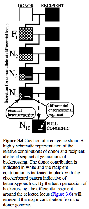
Genetics of KO Lines. The embryonic stem cells used to make KOs are usually derived from a 129 strain of mouse (e.g., 129/OlaHsd). Mutated stem cells are then added to a C57BL/6J blastocyst to generate B6x129 chimeric mice. Germline transmission of the KO allele is tested and carriers are then used to establish heterozygous +/- B6.129 KO stock. This stock is often crossed back to wildtype C57BL/6J strains for several generations. At each generation the transmission of the KO is checked by genotyping the gene or closely flanking markers in each litter of mice. Carriers are again selected for breeding. The end result of this process is a KO congenic line in which the genetic background is primarily C57BL/6J except for the region around the KO gene.
It is often thought that 10 generations of backcrossing will result in a pure genetic background (99.8% C57BL/6J). Unfortunately, this is not true for the region around the KO, and even after many generations of backcrossing of KO stock to C57BL/6J, a large region around the KO is still derived from the 129 substrain (see the residual white "line" at N10 in the figure below.
Legend: Figure from Flaherty, L. (1981) Congenic strains. In The Mouse in Biomedical Research, Vol. 1, Foster, H. L., Small, J. D., and Fox, J. G., eds. (Academic Press, N.Y.), pp. 215-222.
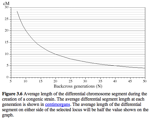
After 20 generations of backcrossing nearly +/-5 cM on either side of the KO will still usually be derived from 129 (see Figure 3.6) This amounts to an average of +/- 10 megabases of DNA around the KO. The wildtype littermates do NOT have this flanking DNA from 129 and they will be like a true C57BL/6J. The +/- 10 megabases to either side of the KO is known as the "hitchhiking" chromosomal interval. Any polymorphism between 129 and B6 in this interval has the potential to have significant downstream effects on gene expression, protein expression, and higher order traits such as anxiety, activity, and maternal behavior. Much of the conventional KO literature is highly suspect due to this hitchhiker effect (see Gerlai R, Trends in Neurosci 1996 19:177).
As one example, consider the thyroid alpha receptor hormone gene Thra and its KO. Thra maps to Chr 11 at about 99 Mb. A conventional KO made as described above will have a hitchhiking 129 chromosomal interval extending from about 89 Mb to 109 Mb even after 20 generations of backcrossing to B6. Since the mouse genome is about 2.6 billion base pairs and contains about 26,000 genes, this 20 Mb region will typically contain about 200 genes. The particular region of Chr 11 around Thra has an unusually high density of genes (2-3X) and includes many highly expressed and polymorphic genes, including Nog, Car10, Cdc34, Col1a1, Dlx4, Myst2, Ngfr, Igf2bp1, Gip, the entire Hoxb complex, Sp6, Socs7, Lasp1, Cacnb1, Pparbp, Pnmt, Erbb2, Grb7, Nr1d1, Casc3, Igfbp4, and the entire Krt1 complex. Of these gene roughly half will be polymorphic between B6 and 129. It is like having a busload of noisy and possibly dangerous hitchhikers. Putative KO effects may be generated by a complex subset of these 100 polymorphic genes.
What is the solution?
- Do not use litter mates as controls without great care. They are not really the correct genetic control. The correct genetic control is a congenic strain of the same general type without the KO or with a different KO in a nearby gene. These are often available as KOs in neighboring genes that are not of interest. For example, the gene Casc3 is located next to Thra. If a KO in Casc3 is available, then compare the two KOs and see if phenotypes of the two KOs differ ways predicted given the known molecular functions of the gene.
- Use a KO in which the KO has been backcrossed to a 129 strain--ideally the same strain from which ES cells were obtained. This eliminates the hitchhiker effect entirely and the KO, HET, and WT littermates really can be compared.
- Use a conditional KO.
- Compare the phenotype of the two parental strains--129 and C57BL/6J and see if they differ in ways that might be confounded with the effects of the KO.
Legend:from Silver, L. (1995) Oxford University Press
Back to Index
I
Interquartile Range:
The interquartile range is the difference between the 75% and 25% percentiles of the distribution. We divide the sample into a high and low half and then compute the median for each of these halves. In other words we effectively split our sample into four ordered sets of values known as quartiles. The absolute value of the difference between the median of the lower half and the median of the upper half is also called the interquartile range. This estimate of range is insenstive to outliers. If you are curious you might double the IQR to get an interquartile-range-based estimate of the full range. Of course, keep in mind that range is dependent on the sample size. For theis reason the coeffficient of variation (the standard deviation divided by the mean) is a better overall indicator of dispersion of values around the mean that is less sensitive to sample size. [Williams RW, Oct 20, 2004; Jan 23, 2005]
Interval Mapping:
Interval mapping is a process in which the statistical significance of a hypothetical QTL is evaluated at regular points across a chromosome, even in the absence of explicit genotype data at those points. In the case of WebQTL, significance is calculated using an efficient and very rapid regression method, the Haley-Knott regression equations (Haley CS, Knott SA. 1992. A simple regression method for mapping quantitative trait loci in line crosses using flanking markers; Heredity 69:315–324), in which trait values are compared to the known genotype at a marker or to the probability of a specific genotype at a test location between two flanking markers. (The three genotypes are coded as -1, 0, and +1 at known markers, but often have fractional values in the intervals between markers.) The inferred probability of the genotypes in regions that have not been genotyped can be estimated from genotypes of the closest flanking markers. GeneNetwork/WebQTL compute linkage at intervals of 1 cM or less. As a consequence of this approach to computing linkage statistics, interval maps often have a characteristic shape in which the markers appear as sharply defined inflection points, and the intervals between nodes are smooth curves. [Chesler EJ, Dec 20, 2004; RWW April 2005; RWW Man 2014]
Interval Mapping Options:
- Permutation Test: Select this option to determine the approximate LRS value that matches a genome-wide p-value of .05.
- Bootstrap Test: Select this option to evaluate the consistency with which peak LRS scores cluster around a putative QTL. Deselect this option if it obscures the SNP track or the additive effect track.
- Additive Effect: The additive effect (shown by the red lines in these plots) provide an estimate of the change in the average phenotype that is brought about by substituting a single allele of one type with that of another type.
- SNP Track: The SNP Seismograph Track provides information on the regional density of segregating variants in the cross that may generate trait variants. It is plotted along the X axis. If a locus spans a region with both high and low SNP density, then the causal variant has a higher prior probability to be located in the region with high density than in the region with low density.
- Gene Track: This track overlays the positions of known genes on the physical Interval Map Viewer. If you hover the cursor over genes on this track, minimal information (symbol, position, and exon number) will appear.
- Display from X Mb to Y Mb: Enter values in megabases to regenerate a smaller or large map view.
- Graph width (in pixels): Adjust this value to obtain larger or smaller map views (x axis only).
Back to Index
J
Back to Index
K
Back to Index
L
Literature Correlation:
The literature correlation is a unique feature in GeneNetwork that quantifies the similarity of words used to describe genes and their functions. Sets of words associated with genes were extracted from MEDLINE/PubMed abstracts (Jan 2017 by Ramin Homayouni, Diem-Trang Pham, and Sujoy Roy). For example, about 2500 PubMed abstracts contain reference to the gene "Sonic hedgehog" (Shh) in mouse, human, or rat. The words in all of these abstracts were extracted and categorize by their information content. A word such as "the" is not interesting, but words such as "dopamine" or "development" are useful in quantifying similarity. Sets of informative words are then compared—one gene's word set is compared the word set for all other genes. Similarity values are computed for a matrix of about 20,000 genes using latent semantic indexing (see Xu et al., 2011). Similarity values are also known as literature correlations. These values are always positive and range from 0 to 1. Values between 0.5 and 1.0 indicate moderate-to-high levels of overlap of vocabularies.
The literature correlation can be used to compare the "semantic" signal-to-noise of different measurements of gene, mRNA, and protein expression. Consider this common situation:There are three probe sets that measure Kit gene expression (1459588_at, 1415900_a_at, and 1452514_a_at) in the Mouse BXD Lung mRNA data set (HZI Lung M430v2 (Apr08) RMA). Which one of these three gives the best measurement of Kit expression? It is impractical to perform quantitative rtPCR studies to answer this question, but there is a solid statistical answer that relies on Literature Correlation. Do the following: For each of the three probe sets, generate the top 1000 literature correlates. This will generate three apparently identical lists of genes that are known from the PubMed literature to be associated with the Kit oncogene. But the three lists are NOT actually identical when we look at the Sample Correlation column. To answer the question "which of the three probe sets is best", review the actual performance of the probe sets against this set of 1000 "friends of Kit". Do this by sorting all three lists by their Sample Correlation column (high to low). The clear winner is probe set 1415900_a_at. The 100th row in this probe set's list has a Sample Correlation of 0.620 (absolute value). In comparison, the 100th row for probe set 1452514_a_at has a Sample Correlation of 0.289. The probe set that targets the intron comes in last at 0.275. In conclusion, the probe set that targets the proximal half of the 3' UTR (1415900_a_at) has the highest "agreement" between Literature Correlation and Sample Correlation, and is our preferred measurement of Kit expression in the lung in this data set.
(Updated by RWW and Ramin Homayouni, April 2017.)
LOD:
The logarithm of the odds (LOD) provides a measure of the association between variation in a phenotype and genetic differences (alleles) at a particular chromosomal locus (see Nyholt 2000 for a lovely review of LOD scores).
A LOD score is defined as the logarithm of the ratio of two likelihoods: (1) in the numerator the likelihood for the alternative hypothesis, namely that there is linkage at the chromosomal marker, and (2) the likelihood of the null hypothesis that there is no linkage. Likelihoods are probabilities, but they are not Pr(hypothesis | data) but rather Pr(data | two alternative hypotheses). That's why they are called likelihoods rather than probabilities. (The "|" symbol above translates to "given the"). Since LOD and LRS scores are associated with two particular hypotheses or models, they are also associated with the degrees of freedom of those two alternative models. When the model only has one degree of freedom this conversion between LOD to p value will work:
lodToPval <-
function(x)
{
pchisq(x*(2*log(10)),df=1,lower.tail=FALSE)/2
}
(from https://www.biostars.org/p/88495/ )
In the two likelihoods, one has maximized over the various nuisance parameters (the mean phenotypes for each genotype group, or overall for the null hypothesis, and the residual variance). Or one can say, one has plugged in the maximum likelihood estimates for these nuisance parameters.
With complete data at a marker, the log likelihood for the normal model reduces to the (-n/2) times the log of the residual sum of squares.
LOD values can be converted to LRS scores (likelihood ratio statistics) by multiplying by 4.61. The LOD is also roughly equivalent to the -log(P), where P is the probability of linkage (P = 0.001 => 3). The LOD itself is not a precise measurement of the probability of linkage, but in general for F2 crosses and RI strains, values above 3.3 will usually be worth attention for simple interval maps. [Williams RW, June 15, 2005, updated with text from Karl Broman, Oct 28, 2010, updated Apr 21, 2020 with Nyholt reference].
LRS:
In the setting of mapping traits, the likelihood ratio statistic is used as a measurement of the association or linkage between differences in traits and differences in particular genotype markers. LRS or LOD values are usually plotted on the y-axis, whereas chromosomal location of the marker are usually plotted on the x-axis. In the case of a whole genome scan--a sequential analysis of many markers and locations across the entire genome--LRS values above 10 to 15 will usually be worth attention for when mapping with standard experimental crosses (e.g., F2 intercrosses or recombinant inbred strains). The term "likelihood ratio" is used to describe the relative probability (likelihood) of two different explanations of the variation in a trait. The first explanation (or model or hypothesis H1) is that the differences in the trait ARE associated with that particular DNA sequence difference or marker. Very small probability values indicate that H1 is probably true. The second "null" hypothesis (Hnull or H0) is that differences in the trait are NOT associated with that particular DNA sequence. We can use the ratio of these two probabilities and models (H1 divided by H0) as our score. The math is a little bit more complicated and the LRS score is actually equal to -2 times the ratio of the natural logarithms of the two probabilities. For example, if the probability of H0 is 0.05 (only a one-in-twenty probability that the marker is associated with the trait by chance), whereas and the probability of H1 is 1 (the marker is certainly not linked to the trait), then the LRS value is 5.991. In Excel the equation giving the LRS result of 5.991 would look like this "=-2*(LN(0.05)-LN(1)). [Williams RW, Dec 13, 2004, updated Nov 18, 2009, updated Dec 19, 2012]
Back to Index
M
Marker Regression:
The relationship between differences in a trait and differences in alleles at a marker (or gene variants) can be computed using a regression analysis (genotype vs phenotype) or as a simple Pearson product moment correlation. Here is a simple example that you can try in Excel to understand marker-phenotype regression or marker-phenotype correlation: enter a row of phenotype and genotype data for 20 strains in an Excel spreadsheet labeled "Brain weight." The strains are C57BL/6J, DBA/2J, and 20 BXD strains of mice (1, 2, 5, 6, 8, 9, 12, 13, 14, 15, 16, 18, 21, 22, 23, 24, 25, 27, 28, and 29. The brains of these strains weigh an average (in milligrams) of 465, 339, 450, 390, 477, 361, 421, 419, 412, 403, 429, 429, 436, 427, 409, 431, 432, 380, 394, 381, 389, and 375. (These values are taken from BXD Trait 10032; data by John Belknap and colleagues, 1992. Notice that data are missing for several strains including the extinct lines BXD3, 4, and 7. Data for BXD11 and BXD19 (not extinct) are also missing. In the second row enter the genotypes at a single SNP marker on Chr 4 called "rs13478021" for the subset of strains for which we have phenotype data. The genotypes at rs1347801 are as follows for 20 BXDs listed above: D B D B D B D D D D D B D B D B D B D B. This string of alleles in the parents and 20 BXDs is called a strains distribution pattern (SDP). Let's convert these SDP letters into more useful numbers, so that we can "compute" with genotypes. Each B allele gets converted into a -1 and each D allele gets converted into a +1. In the spreadsheet, the data set of phenotypes and genotypes should look like this.
Strain BXD1 BXD2 BXD5 6 8 9 12 13 14 15 16 18 21 22 23 24 25 27 28 29
Brain_weight 450 390 477 361 421 419 412 403 429 429 436 427 409 431 432 380 394 381 389 375
Marker_rs1347801 D B D B D B D D D D D B D B D B D B D B
Marker_code 1 -1 1 -1 1 -1 1 1 1 1 1 -1 1 -1 1 -1 1 -1 1 -1
To compute the marker regression (or correlation) we just compare values in Rows 2 and 4. A Pearson product moment correlation gives a value of r = 0.494. A regression analysis indicates that on average those strains with a D allele have a heavier brain with roughly a 14 mg increase for each 1 unit change in genotype; that is a total of about 28 mg if all B-type strains are compared to all D-type strains at this particular marker. This difference is associated with a p value of 0.0268 (two-tailed test) and an LRS of about 9.8 (LOD = 9.8/4.6 or about 2.1). Note that the number of strains is modest and the results are therefore not robust. If you were to add the two parent strains (C57BL/6J and DBA/2J) back into this analysis, which is perfectly fair, then the significance of this maker is lost (r = 0.206 and p = 0.3569). Bootstrap and permutation analyses can help you decide whether results are robust or not and whether a nominally significant p value for a single marker is actually significant when you test many hundreds of markers across the whole genome (a so-called genome-wide test with a genome-wide p value that is estimated by permutation testing).
[RWW, Feb 20, 2007, Dec 14, 2012]
Back to Index
N
Normal Probability Plot:
A normal probability plot is a powerful tool to evaluate the extent to which a distribution of values conforms to (or deviates from) a normal Gaussian distribution. The Basic Statistics tools in GeneNetwork provides these plots for any trait. If a distribution of numbers is normal then the actual values and the predicted values based on a z score (units of deviation from the mean measured in standard deviation units) will form a nearly straight line. These plots can also be used to efficiently flag outlier samples in either tail of the distribution.
In genetic studies, the probability plot can be used to detect the effects of major effect loci. A classical Mendelian locus will typically be associated with either a bimodal or trimodal distribution. In the plot below based on 99 samples, the points definitely do not fall on a single line. Three samples (green squares) have unusually high values; the majority of samples fall on a straight line between z = -0.8 to z = 2; and 16 values have much lower trait values than would be predicted based on a single normal distribution (a low mode group). The abrupt discontinuity in the distribution at -0.8 z is due to the effect of a single major Mendelian effect.
Deviations from normality of the sort in the figure below should be considered good news from the point of view of likely success of tracking down the locations of QTLs. However, small numbers of outliers may require special statistical handling, such as their exclusion or winsorising (see more below on "Winsorizing"). [RWW June 2011]
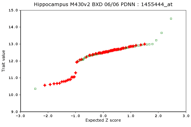
Legend: Example of a probability plot for a trait with a major QTL effect. In this case we have plotted the measured expression value on the Gabra2 receptor mRNA in hippocampus on the y-axis and the expected Z score value on the x-axis.
Back to Index
O
Outliers: (also see Wikipedia)
Statistical methods often assume that the distribution of trait values is close to a Gaussian normal bell-shaped curve and that there are no outlier values that are extremely high or low compared to the average. Some traits can be clearly split into two or more groups (affected cases and unaffected cases) and this is not a problem as long as the number of cases in each group is close to the number that you expected by chance and that your sample size is reasonable high (40 or more for recombinant inbred strains). Mapping functions and most statistical procedure in GeneNetwork should work reasonable well (the pair scan function for epistatic interactions is one possible exception).
However, correlations and QTL mapping methods can be highly sensitive to outlier values. Make sure you review your data for outliers before mapping. GeneNetwork flags all outliers for you in the Trait Data and Analysis window and gives you the option of zapping these extreme values. Options include (1) do nothing, (2) delete the outliers and see what happens to your maps, (3) Winsorize the values of the outliers. You might try all three options and determine if your main results are stable or not. With small samples or extreme outliers, you may find the correlation and mapping results to be volatile. In general, if results (correlations, QTL positions or QTL LRS score) depend highly on one or two outliers (5-10% of the samples) then you should probably delete or winsorize the outliers.
In order to calculate outliers, we first determine the Q1(25%) and Q3(75%) values and then multiply by a constant (in our case 1.5; a higher constant is less sensitive to outliers). This value is then subtracted from the Q1 value and added to the Q3 value in order to determine the lower and upper bounds. Values that fall above the upper bound or below the lower bound are considered outliers.
The method is summarized here.
[Sloan ZA, Oct 2013]
Back to Index
P
Pair-Scan, 2D Genome Scan, or Two-QTL Model:
The pair scan function evaluates pairs of intervals (loci) across the genome to determine how much of the variability in the trait can be explained jointly by two putative QTLs. The pair scan function in GeneNetwork is used to detect effects of pairs of QTLs that have epistatic interactions, although this function also evaluates summed additive effects of two loci. Trait variance is evaluated using a general linear model that has this structure (called a "model"):
Variance V(trait) = QTL1 + QTL2 + QTL1xQTL2 + error (where the = sign should be read "a function of"
This model is also known as the Full Model (LRS Full in the output table), where QTL1 and QTL2 are the independent additive effects associated with two unlinked loci (the so-called main effects) and QTL1xQTL2 is the interaction term (LRS Interact in the output table). An LRS score is computed for this full model. This is computation identical to computing an ANOVA that allows for an interaction term between two predictors. The additive model that neglects the QTL1XQTL2 term is also computed.
The output table in GeneNetwork list the the two intervals at the top of the table (Interval 1 to the left and Interval 2 to the far right). The LRS values for different components of the model are shown in the middle of the table (LRS Full, LRS Additive, LRS Interact, LRS 1, and LRS 2). Note that LRS 1 and LRS 2 will usually NOT sum to LRS Additive.
CAUTIONS and LIMITATIONS: Pair-scan is only implemented for recombinant inbred strains. We do not recommend the use of this function with sample sizes of less than 60 recombinant inbred strains. Pair-scan procedures need careful diagnostics and an be very sensitive to outliers and to the balance among the four possible two-locus genotype classes among a set of RI strains. Pair-scan is not yet implemented for F2 progeny.
GeneNetwork implements a rapid but non-exhaustive DIRECT algorithm (Lundberg et al., 2004) that efficiently searches for epistatic interactions. This method is so fast that it is possible to compute 500 permutations to evaluate non-parametric significance of the joint LRS value within a minute. This makes DIRECT ideal for an interactive web service. Karl Broman's R/qtl implements an exhaustive search using the "scantwo" function. [RWW, May 2011]
Partial Correlation:
Partial correlation is the correlation between two variables that remains after controlling for one or more other variables. Idea and techniques used to compute partial correlations are important in testing causal models (Cause and Correlation in Biology, Bill Shipley, 2000). For instance, r1,2||3,4 is the partial correlation between variables 1 and 2, while controlling for variables 3 and 4 (the || symbol is equivalent to "while controlling for"). We can compare partial correlations (e.g., r1,2||3,4) with original correlations (e.g., r1,2). If there is an insignificant difference, we infer that the controlled variables have minimal effect and may not influence the variables or even be part of the model. In contrast, if the partial correlations change significantly, the inference is that the causal link between the two variables is dependent to some degree on the controlled variables. These control variables are either anteceding causes or intervening variables. (text adapted from D Garson's original by RWW).
For more on
partial correlation please link to this great site by David Garson at NC State.
For more on dependence separation (
d-separation) and constructing causal models see Richard Scheines' site.
Why would you use of need partial correlations in GeneNetwork? It is often useful to compute correlations among traits while controlling for additional variables. Partial correlations may reveal more about the causality of relations. In a genetic context, partial correlations can be used to remove much of the variance associated with linkage and linkage disequilibrium. You can also control for age, age, and other common cofactors.
Please see the related Glossary terms "Tissue Correlation". [RWW, Aug 21, 2009; Jan 30, 2010]
PCA Trait or Eigentrait:
If you place a number of traits in a Trait Collection you can carry out some of the key steps of a principal component analysis, including defining the variance directed along specific principal component eigenvectors. You can also plot the positions of cases against the first two eigenvectors; in essence a type of scatterplot. Finally, GeneNetwork allows you to exploit PCA methods to make new "synthetic" eigentraits from collections of correlated traits. These synthetic traits are the values of cases along specific eigenvectors and they may be less noisy than single traits. If this seems puzzling, then have a look at these useful PCA explanation by G. Dallas and by Powell and Lehe.
How to do it: You can select and assemble many different traits into a single Trait Collection window using the check boxes and Add To Collection buttons. One of the most important function buttons in the Collection window is labeled Correlation Matrix. This function computes Pearson product moment correlations and Spearman rank order correlations for all possible pairs of traits in the Collection window. It also perfoms a principal component or factor analysis. For example, if you have 20 traits in the Collection window, the correlation matrix will consist of 20*19 or 190 correlations and the identity diagonal. Principal components analysis is a linear algebraic procedure that finds a small number of independent factors or principal components that efficiently explain variation in the original 20 traits. It is a effective method to reduce the dimensionality of a group of traits. If the 20 traits share a great deal of variation, then only two or three factors may explain variation among the traits. Instead of analyzing 20 traits as if they were independent, we can now analyze the main principal components labeled PC01, PC02, etc. PC01 and PC02 can be treated as new synthetic traits that represent the main sources of variation among original traits. You can treat a PC trait like any other trait except that it is not stored permanently in a database table. You can put a PC trait in your Collection window and see how well correlated each of the 20 original traits is with this new synthetic trait. You can also map a PC trait. [RWW, Aug 23, 2005]
Permutation Test:
A permutation test is a computationally intensive but conceptually simple method used to evaluate the statisical significance of findings. Permutation tests are often used to evaluate QTL significance. Some background: In order to detect parts of chromosomes that apparently harbor genes that contribute to differences in a trait's value, it is common to search for associations (linkage) across the entire genome. This is referred to as a "whole genome" scan, and it usually involves testing hundreds of independently segregating regions of the genome using hundreds, or even thousands of genetic markers (SNPs and microsatellites). A parametric test such as a conventional t test of F test can be used to estimate the probability of the null hypothesis at any single location in the genome (the null hypothesis is that there is no QTL at this particular location). But a parametric test of this type makes assumptions about the distribution of the trait (its normality), and also does not provide a way to correct for the large number of independent tests that are performed while scanning the whole genome. We need protection against many false discoveries as well as some assurance that we are not neglecting truly interesting locations. A permutation test is an elegant solution to both problems. The procedure involves randomly reassigning (permuting) traits values and genotypes of all cases used in the analysis. The permuted data sets have the same set of phenotypes and genotypes (in other words, distributions are the same), but obviously the permutation procedure almost invariably obliterates genuine gene-to-phenotype relation in large data sets. We typically generate several thousand permutations of the data. Each of these is analyzed using precisely the same method that was used to analyze the correctly ordered data set. We then compare statistical results of the original data set with the collection of values generated by the many permuted data sets. The hope is that the correctly ordered data are associated with larger LRS and LOD values than more than 95% of the permuted data sets. This is how we define the p = .05 whole genome significance threshold for a QTL. Please see the related Glossary terms "Significant threshold" and "Suggestive threshold". [RWW, July 15, 2005]
Power to detect QTLs:
An analysis of statistical power is useful to estimate numbers of replicates and strains needed to detect and resolve major sources of trait variance and covariance. A versatile method has been developed by Sen and colleagues (Sen et al., 2007) and implemented in the R program. qtlDesign.
David Ashbrook implemented a version of this within Shiny that can help you estimate power for different QTL effect sizes, cohort sizes, and replication rates:
Power Calculator (D. Ashbrook)
We can see that in all situations power is increased more by increasing the number of lines than by increasing the number of biological replicates. Dependent upon the heritability of the trait, there is little gain in power when going above 4-6 biological replicates. [DGA, Mar 3, 2018]
Probes and Probe Sets:
In microarray experiments the probe is the immobilized sequence on the array that is complementary to the target message washed over the array surface. Affymetrix probes are 25-mer DNA sequences synthesized on a quartz substrate. There are a few million of these 25-mers in each 120-square micron cell of the array. The abundance of a single transcript is usualy estimated by as many as 16 perfect match probes and 16 mismatch probes. The collection of probes that targets a particular message is called a probe set. [RWW, Dec 21, 2004]
Back to Index
Q
QTL:
A quantitative trait locus is a chromosome region that contains one or more sequence variants that modulates the distribution of a variable trait measured in a sample of genetically diverse individuals from an interbreeding population. Variation in a quantitative trait may be generated by a single QTL with the addition of some environmental noise. Variation may be oligogenic and be modulated by a few independently segregating QTLs. In many cases however, variation in a trait will be polygenic and influenced by large number of QTLs distributed on many chromosomes. Environment, technique, experimental design and a host of other factors also affect the apparent distribution of a trait. Most quantitative traits are therefore the product of complex interactions of genetic factors, developmental and epigenetics factors, environmental variables, and measurement error. [Williams RW, Dec 21, 2004]
Back to Index
R
Recombinant Inbred Strain (RI or RIS) or Recombinant Inbred Line (RIL):
An inbred strain whose chromosomes incorporate a fixed and permanent set of recombinations of chromosomes originally descended from two or more parental strains. Sets of RI strains (from 10 to 5000) are often used to map the chromosomal positions of polymorphic loci that control variance in phenotypes.
For a terrific short summary of the uses of RI strains see 2007).
Chromosomes of RI strains typically consist of alternating haplotypes of highly variable length that are inherited intact from the parental strains. In the case of a typical rodent RI strain made by crossing maternal strain C with paternal strain B (called a CXB RI strain), a chromosome will typically incorporate 3 to 5 alternating haplotype blocks with a structure such as BBBBBCCCCBBBCCCCCCCC, where each letter represents a genotype, series of similar genotype represent haplotypes, and where a transition between haplotypes represents a recombination. Both pairs of each chromosome will have the same alternating pattern, and all markers will be homozygous. Each of the different chromosomes (Chr 1, Chr 2, etc.) will have a different pattern of haplotypes and recombinations. The only exception is that the Y chromosome and the mitochondial genome, both of which are inherited intact from the paternal and maternal strain, respectively. For an RI strain to be useful for mapping purposes, the approximate position of recombinations along each chromsome need to be well defined either in terms of centimorgan or DNA basepair position. The precision with which these recombinations are mapped is a function of the number and position of the genotypes used to type the chromosomes--20 in the example above. Because markers and genotypes are often space quite far apart, often more than 500 Kb, the actual data entered into GeneNetwork will have some ambiguity at each recombination locus. The haplotype block BBBBBCCCCBBBCCCCCCCC will be entered as BBBBB?CCCC?BBB?CCCCCCCC where the ? mark indicates incomplete information over some (we hope) short interval.
RI strains are almost always studied in sets or panels. All else being equal, the larger the set of RI strains, the greater the power and precision with which phenotypes can be mapped to chromosomal locations. The first set of eight RIs, the CXB RIs, were generated by Donald Bailey (By) from an intercross between a female BALB/cBy mouse (abbreviated C) and a male C57BL/6By mouse in the 1960s. The small panel of 8 CXB strains was originally used to determine if the major histocompatibility (MHC) locus on proximal Chr 17 was a key factor accounting for different immune responses such as tissue rejection. The methods used to determine the locations of recombinations relied on visible markers (coat color phenotypes such as the C and B loci) and the electrophoretic mobility of proteins. Somewhat larger RI sets were generated by Benjamin Taylor to map Mendelian and other major effect loci. In the 1990s the utility of RI sets for mapping was significantly improved thanks to higher density genotypes made possible by the use of microsatellite markers. Between 2005 and 2017, virtually all extant mouse and rat RI strains were regenotyped at many thousands of SNP markers, providing highly accurate maps of recombinations.
While the potential utility of RI strains in mapping complex polygenic traits was obvious from the outset, the small number of strains only made it feasible to map quantitative traits with large effects. The first large RI sets were generated by plant geneticists (Burr et al. 2000) and this the plant genetics community holds a strong lead in the production of very large RI sets to study multigenic and polygenic traits and trait covariance and pleiotropy.
By 2010 the number of mouse RI strains had increased to the point where defining causal gene and sequence variant was more practical. As of 2018 there are about 150 BXD strains (152 have been fully sequenced), ~100 Collaborative Cross strains (also all fully sequenced), and at least another 100 RI strains belonging to smaller sets that have been extremely well genotyped.
Making RI strains: The usual procedure typically involves sib mating of the progeny of an F1 intercross for more than 20 generations. Even by the 5th filial (F) generation of successive matings, the RI lines are homozygous at 50% of loci and by F13, the value is above 90%. At F20 the lines are nearly fully inbred (~98%) and by convention are now referred to as inbred strains rather than inbred lines.
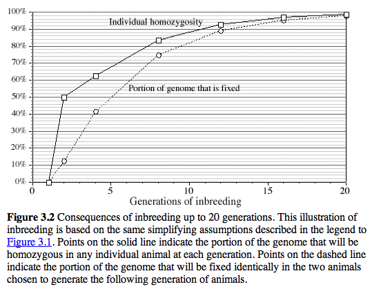
Legend:from Silver, L. (1995) Oxford University Press
[Williams RW, June 20, 2005; significant extension, Sept 21, 2007, added Crow ref, Oct 2009]
Back to Index
S
Scree Plots:
GeneNetwork will often automatically generate a Scree Plot and the associated principal components (PCs) when you compute a Correlation Matrix for a group of traits that you have placed in your Trait Collection (a set of phenotypes and/or expression data for a specific population). Here is a nice definition of what a Scree plot is trying to tell you adopted and adapted from IOS (www.improvedoutcomes.com).
A Scree Plot is a simple line segment plot that shows the fraction of total variance in the data as explained or represented by each PC. The PCs are ordered, and by definition are therefore assigned a number label, by decreasing order of contribution to total variance. The PC with the largest fraction contribution is labeled PC01. Such a plot when read left-to-right across the abscissa can often show a clear separation in fraction of total variance where the 'most important' components cease and the 'least important' components begin. The point of separation is often called the 'elbow'. (In the PCA literature, the plot is called a 'Scree' Plot because it often looks like a 'scree' slope, where rocks have fallen down and accumulated on the side of a mountain.) [Williams RW, Dec 20, 2008]
Significant threshold:
The significant threshold represents the approximate LRS value that corresponds to a genome-wide p-value of 0.05, or a 5% probability of falsely rejecting the null hypothesis that there is no linkage anywhere in the genome. This threshold is computed by evaluating the distribution of highest LRS scores generated by a set of 2000 random permutations of strain means. For example, a random permutation of the correctly ordered data may give a peak LRS score of 10 somewhere across the genome. The set of 1000 or more of these highest LRS scores is then compared to the actual LRS obtained for the correctly ordered (real) data at any location in the genome. If fewer than 50 (5%) of the 1000 permutations have peak LRS scores anywhere in the genome that exceed that obtained at a particular locus using the correctly ordered data, then one can usually claim that a QTL has been defined at a genome-wide p-value of .05. The threshold will vary slightly each time it is recomputed due to the random generation of the permutations. You can view the actual histogram of the permutation results by selecting the "Marker Regression" function in the Analysis Tools area of the Trait Data and Editing Form. WebQTL does make it possible to search through hundreds of traits for those that may have significant linkage somewhere in the genome. Keep in mind that this introduces a second tier of multiple testing problems for which the permutation test will not usually provide adequate protection. If you anticipate mapping many independent traits, then you will need to correct for the number of traits you have tested. [Williams RW, Nov 14, 2004]
SNP Seismograph Track:
SNP is an acronym for single nucleotide polymorphisms (SNPs). SNPs are simple one base pair variants that distinguish individuals and strains. The SNP Seismograph track is a unique feature of physical maps in the GeneNetwork. Each track is customized for a particular cross and shows only those SNPs that differ between the two parental strains. For example, on mouse BXD maps, only the SNPs that differ between C57BL/6J and DBA/2J will be displayed. Regions with high numbers of SNPs are characterised by wider excursions of the yellow traces that extends along the x axis. Since these regions have many SNPs they have a higher prior probability of containing functional sequence differences that might have downstream effects on phenotypes. Large genes with many SNPs close to the peak LRS and that also have a biological connection with the trait ypu are studying are high priority candidate genes.
The SNP track in WebQTL exploits the complete Celera Discovery System SNP set but adds an additional 500,000 inferred SNPs in both BXD and AXB/BXA crosses. These SNPs were inferred based on common haplotype structure using an Monte Carlo Markov chain algorithm developed by Gary Churchill and Natalie Blades and implemented by Robert Crowell, and RWW in July 2004. Raw data used to generate the SNP seismograph track were generated by Alex Williams and Chris Vincent, July 2003. The BXD track exploits a database of 1.75 million B vs D SNPs, whereas the AXB/BXA track exploits a database of 1.80 million A vs B SNPs. The names, sequences, and precise locations of most of these SNPs are the property of Celera Discovery Systems, whom we thank for allowing us to provide this level of display in WebQTL.
Approximately 2.8 million additional SNPs generated by Perlegen for the NIEHS have been added to the SNP track by Robert Crowell (July-Aug 2005). We have also added all Wellcome-CTC SNPs and all relevant mouse SNPs from dbSNP.
[Williams RW, Dec 25, 2004; Sept 3, 2005]
Standard Error of the Mean (SE or SEM):
In most GeneNetwork data sets, the SEM is computed as:
Standard Deviation (SD) divided by the square root of n - 1
where n is the number of independent biological samples used to estimate the population mean. What this means in practice is that when n = 2 (as in many microarray data sets), the SEM and the SD are identical. This method of computing the SEM is conservative, but corrects to some extent for well known bias of the SEM discussed by Gurland and Tripathi (1971, A simple approximation for unbiased estimation of the standard deviation. Amer Stat 25:30-32). [Williams RW, Dec 17, 2008]
Strain Distribution Pattern:
A marker such as a SNP or microsatellite is genotyped using DNA obtained from each member of the mapping population. In the case of a genetic reference population, such as the BXD strains or the BayXSha Arabadopsis lines, this results in a text string of genotypes (e.g., BDDDBDBBBBDDBDDDBBBB... for BXD1 through BXD100). Each marker is associated with its own particular text string of genotypes that is often called the strain distribution pattern of the marker. (A more appropriate term would be the marker genotype string.) This string is converted to a numerical version, a genotype vector: -1111-11-1-1-1-111-1111-1-1-1-1..., where D=1, B=-1, H=0. Mapping a trait boils down to performing correlations between each trait and all of the genotype vectors. The genotype vector with the highest correlation (absolute value) is a good candidate for a QTL. [Williams RW, June 18, 2005]
Suggestive Threshold:
The suggestive threshold represents the approximate LRS value that corresponds to a genome-wide p-value of 0.63, or a 63% probability of falsely rejecting the null hypothesis that there is no linkage anywhere in the genome. This is not a typographical error. The Suggestive LRS threshold is defined as that which yields, on average, one false positive per genome scan. That is, roughly one-third of scans at this threshold will yield no false positive, one-third will yield one false positive, and one-third will yield two or more false positives. This is a very permissive threshold, but it is useful because it calls attention to loci that may be worth follow-up. Regions of the genome in which the LRS exceeds the suggestive threshold are often worth tracking and screening. They are particularly useful in combined multicross metaanalysis of traits. If two crosses pick up the same suggestive locus, then that locus may be significant when the joint probability is computed. The suggestive threshold may vary slightly each time it is recomputed due to the random generation of permutations. You can view the actual histogram of the permutation results by selecting the "Marker Regression" function in the Analysis Tools area of the Trait Data and Editing Form. [Williams RW and Manly KF, Nov 15, 2004]
Systems Genetics:
Systems genetics or "network genetics" is an emerging new branch of genetics that aims to understand complex causal networks of interactions at multiple levels of biological organization. To put this in a simple context: Mendelian genetics can be defined as the search for linkage between a single trait and a single gene variant (1 to 1); complex trait analysis can be defined as the search for linkage between a single trait and a set of gene variants (QTLs, QTGs, and QTNs) and environmental cofactors (1 to many); and systems genetics can be defined as the search for linkages among networks of traits and networks of gene and environmental variants (many to many).
A hallmark of systems genetics is the simultaneous consideration of groups (systems) of phenotypes from the primary level of molecular and cellular interactions that ultimately modulate global phenotypes such as blood pressure, behavior, or disease resistance. Changes in environment are also often important determinants of multiscalar phenotypes; reversing the standard notion of causality as flowing inexorably upward from the genome. Scientists who use a systems genetics approach often have a broad interest in modules of linked phenotypes. Causality in these complex dynamic systems is often contingent on environmental or temporal context, and often will involve feedback modulation. A systems genetics approach can be unusually powerful, but does require the use of large numbers of observations (large sample size), and more advanced statistical and computational models.
Systems genetics is not really a new field and traces back to Sewall Wright's classical paper (Wright, 1921, "Correlation and Causation") that introduced path analysis to study systems of related phenotypes. Two factors have invigorated this field. The first factor is the advent of more sophisticated statistical methods including Structural Equation Modeling (SEM), System Dynamics Modeling, and Bayesian Network Modeling combined with powerful computer systems and efficient algorithms. The second factor is the relative ease with which it is now possible to acquire extensive and diverse phenotype data sets across genetic reference populations such as the BXD set of mice, the HXB set of rats, and the BayXSha lines of Arabidopsis (data are incorporated in the GeneNetwork). In the case of the BXD strains, a large research community has collectively generated hundreds of thousands of transcript phenotypes in different tissues and cells (level of expression), as well as hundreds of protein, cellular, pharmacological, and behavioral data types across a single genetic reference panel. Evaluating and modeling the associative and causal relations among these phenotypes is a major, and still relatively new area of research. Complex trait analysis and QTL mapping are both part of systems genetics in which causality is inferred using conventional genetic linkage (Li et al., 2005). One can often assert with confidence that a particular module of phenotypes (component of the variance and covariance) is modulated by sequence variants at a common locus. This provides a causal constraint that can be extremely helpful in more accurately modeling network architecture. Most models are currently static, but as the field matures, more sophisticated dynamic models will supplant steady-state models.
The term "systems genetics" was coined by Grant Morahan, October 2004, during a visit to Memphis, as a more general and appropriate term to use instead of "genetical genomics." [Williams RW, April 11, 2005, revised Oct 22, 2005, April, 2008]
Back to Index
T
Tissue Correlation:
The tissue correlation is an estimate of the similarity of expression of two genes across different cells, tissues, or organs. In order to compute this type of correlation we first generate expression data for multiple different cell types, tissues, or whole organs from a single individual. There will be significant differences in gene expression across this sample and this variation can then be used to compute either Pearson product-moment correlations (r) or Spearman rank order correlations (rho) between any pair of genes, transcripts, or even exons. Since the samples are ideally all from one individual there should not be any genetic or environmental differences among samples. The difficulty in computing tissue correlations is that samples are not independent. For example, three samples of the small intestine (jejunum, ilieum, and duodenum) will have expression patterns that are quite similar to each other in comparison to three other samples, such as heart, brain, and bone. For this reason the nature of the sampling and how those samples are combined will greatly affect the correlation values. The tissue correlations in GeneNetwork were computed in a way that attempts to reduce the impact of this fact by combining closely related sample types. For example multiple data sets for different brain region were combined to generate a single average CNS tissue sample (generating a whole brain sample would have been an alternative method).
However, there is really not optimal way to minimize the effects of this type of non-independence of samples. Some genes will have high expression in only a few tissues, for example the cholinergic receptor, nicotinic, alpha polypeptide 1 gene Chrna1 has high expression in muscle tissues (skeletal muscle = Mus, tongue = Ton, and esophagus = Eso) but lower expression in most other tissues. The very high correlation between Chrna1 and other genes with high expression only in muscle reflects their joint bimodality of expression. It does not mean that these genes or their proteins necessarily cooperate directly in molecular processes. [Williams RW, Dec 26, 2008]
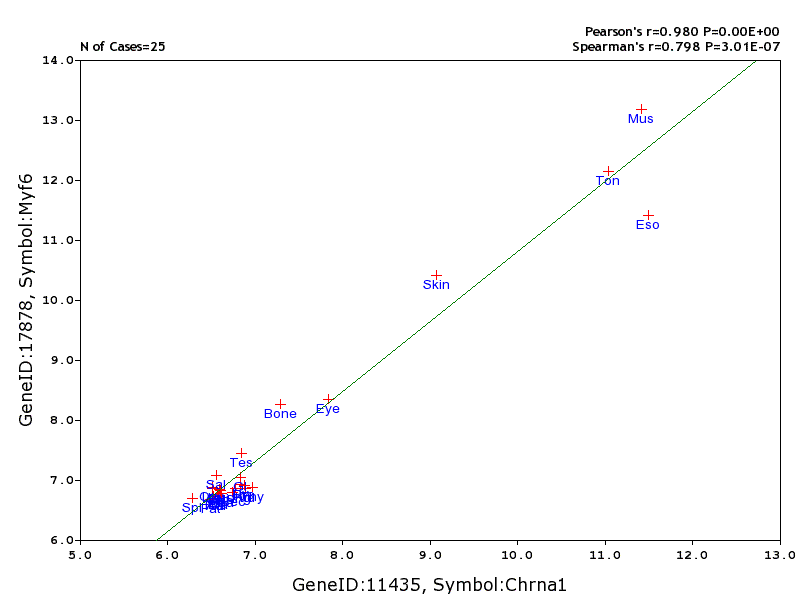
Legend: The tissue correlation between the expression of the cholinergic receptor, nicotinic, alpha polypeptide 1 gene (Chrna1) and that of the myogenic factor 6 gene Myf6. The Pearson product-moment correlation is extremely high. This is largely due to the fact that the expression values are not normally distributed across the 25 samples. The rank order correlation is a more conservative estimate. (
Transcript Location:
The small orange triangle on the x-axis indicates the approximate position of the gene that corresponds to the transcript. These values were taken from the latest assembly of genome of the particular species.
Transform:
Most of the data sets in the GeneNetwork are ultimately derived from high resolution images of the surfaces of microarrays. Estimates the gene expression therefore involves extensive low-level image analysis. These processesing steps attempt to compensate for low spatial frequency "background" variation in image intensity that cannot be related to the actual hybridization signal, for example, a gradation of intensity across the whole array surface due to illumination differences, uneven hybridization, optical performance, scanning characteristics, etc. High spatial frequeny artifacts are also removed if they are likely to be artifacts: dust, scrathes on the array surface, and other "sharp" blemishes. The raw image data (for example, the Affymetrix DAT file) also needs to be registered to a template that assigns pixel values to expected array spots (cells). This image registration is an important process that users can usually take for granted. The end result is the reliable assignment of a set of image intensity values (pixels) to each probe. Each cell value generated using the Affymetrix U74Av2 array is associated with approximately 36 pixel intensity values (a 6x6 set of pixels, usually an effective 11 or 12-bit range of intensity). Affymetrix uses a method that simply ranks the values of these pixels and picks as the "representative value" the pixel that is closest to a particular rank order value, for example, the 24th highest of 36 pixels. The range of variation in intensity values amoung these ranked pixels provides a way to estimate the error of the estimate. The Affymetrix CEL files therefore consist of XY coordinates, the consensus value, and an error term. [Williams RW, April 30, 2005]
Transgression:
Most of us are familiar with the phrase "regression toward the mean." This refers to the tendency of progeny of a cross to have phenotype that are intermediate to those of the parents. Transgression refers to the converse: progeny that have more phenotypes that are higher and lower than those of either parent. Transgression is common, and provided that a trait is influenced by many independent sequence variants (a polygenic trait), transgression is the expectation. This is particularly true if the parents are different genetically, but by chance have similar phenotypes. Consider a trait that is controlled by six independent genes, A through F. The "0" allele at these size genes lowers body weight whereas the "1" allele increases body weight. If one parent has a 000111 6-locus genotype and the other parent has 111000 genotype, then they will have closely matched weight. But their progeny may inherit combinations as extreme as 000000 and 111111.
Transgression means that you can rarely predict the distribution of phenotypes among a set of progeny unless you already have a significant amount of information about the genetic architecture of a trait (numbers of segregating variants that affect the trait, either interactions, and GXE effects). In practical terms this means that if the parents of a cross do NOT differ and you have good reasons to believe that the trait you are interested in is genetically complex, then you can be fairly confident that the progeny will display a much wider range of variation that the parents. [May 2011 by RWW]
Back to Index
U
Back to Index
V
Back to Index
W
Winsorize, Winsorise:
QTL mapping results can be greatly affected by inclusion of outlier data. GeneNetwork will do its best to flag outliers for you in the Trait Data and Analysis pages (yellow highlighting). Before mapping, review the data, and if necessary, change values. Options for handling outliers include: (1) do nothing, (2) delete the outliers (trimming), (3) transform the data (e.g., logarithmic, arcsine, or logistic regression transforms), or (4) winsorize the distribution of values. Winsorizing is usually the easiest method to implement directly in GeneNetwork.
How to winsorize: First review the distribution of values and define outliers. You should only do this one time, so think before you leap. Look at the Probability Plot of the trait by going to Trait Data and Analysis page and selecting Basic Statistics). For example, the figure below from GeneNetwork shows that at many as seven cases have relatively high values and as many as three have relatively low values (this trait is taken from Species = Mouse, Group = LXS, Type = Phenotype, Trait 10182). GeneNetwork code only declares the highest two values to be outliers, but you can use a more liberal definition and give all seven high values a haircut. It is advisable to winsorizes equal numbers of cases on each side of the distribution (high and low cases). In this case, the seven highest values were changed to match that of the 8th highest value (0.860). To retain the original rank order I added an incremental value of 0.01 to each (0.861, 0.862, etc). I did the same thing to the lowest seven values. Adding this increment is not necessary.
The result in this case: a suggestive QTL on Chr 16 now reaches the significance threshold.
The danger of winsorizing is doing it multiple times in different ways. You should transform or winsorize the data before mapping. And you should ideally only do any transformation/correction one time. If you fool around with different methods of transforming your data then you are asking for trouble by adding yet another level of multiple testing. If you feel compelled to experiment with different transforms, then you should/must report this in publications and explain why you did so. Demonstrating that mapping results are robust even using multiple transforms is one good excuse. [Williams RW, Jan 2, 2014]
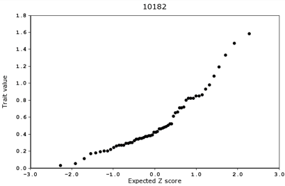
Legend: Example of a probability plot that should be winsorized. The top figures shows the original data. The bottom plot shows the plot after winsorizing the top and bottom 7 values.
Back to Index
X
Back to Index
Y
Back to Index
Z
Back to Index
You are welcome to cite or reproduce these glossary definitions. Please cite or link:
Author AA. "Insert Glossary Term Here."
From The WebQTL Glossary--A GeneNetwork Resource. gn1.genenetwork.org/glossary.html
About this text file
Glossary begun November 2004 by RWW. Last edits: June 16, 2005 by RWW.
|